Client : Sitaram Bhartia Institute
Sitaram Bhartia Institute
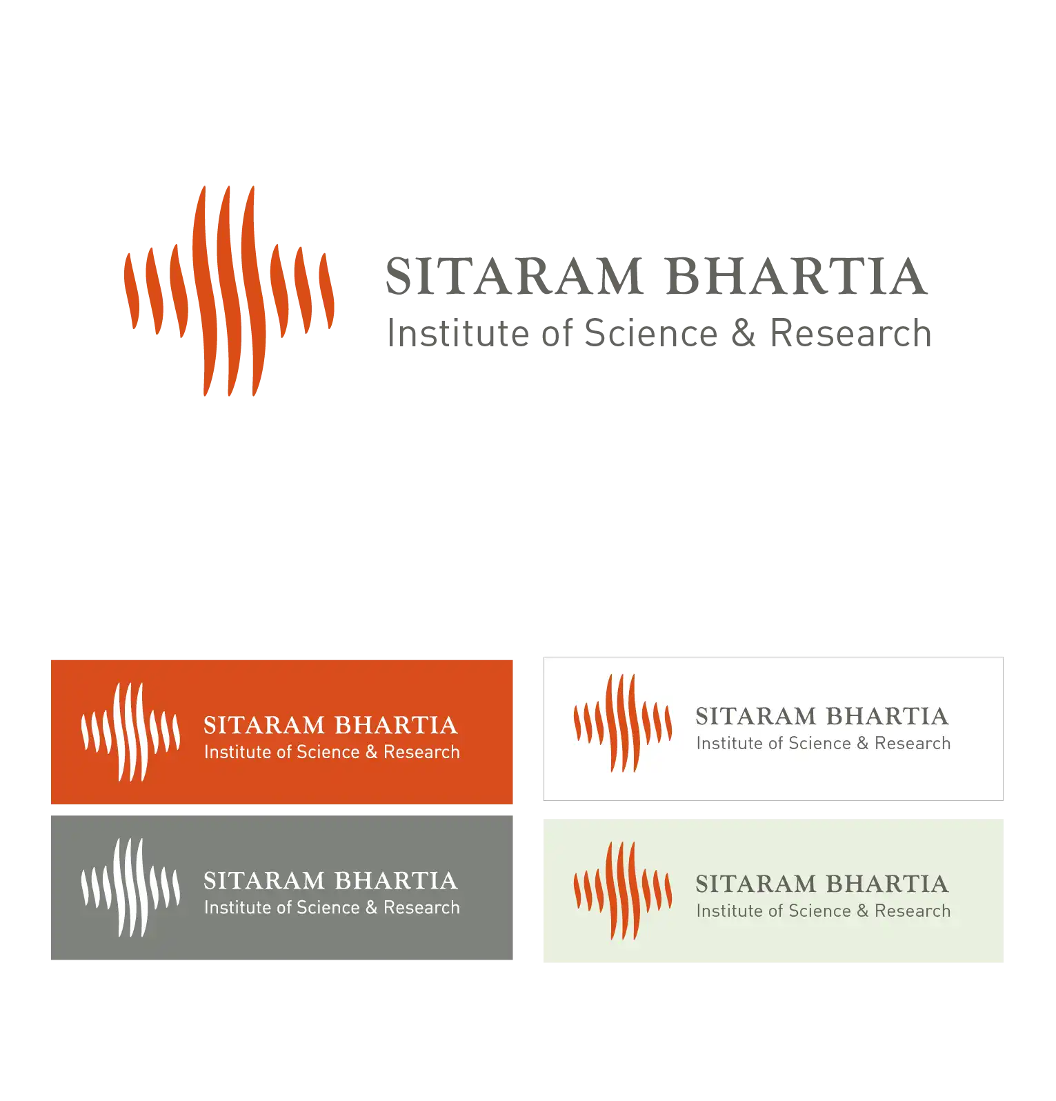
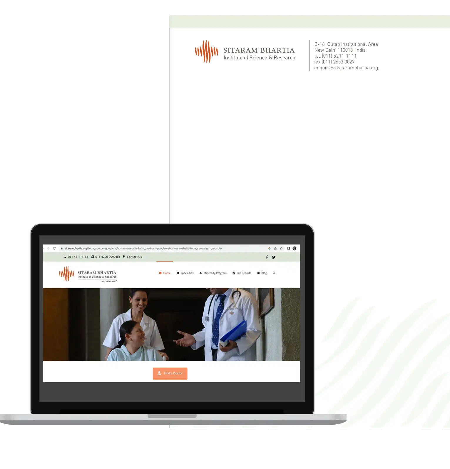
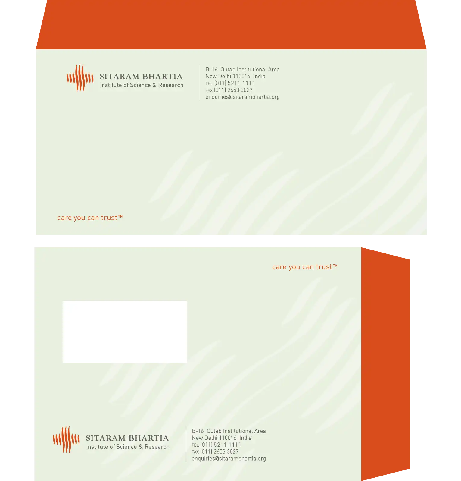
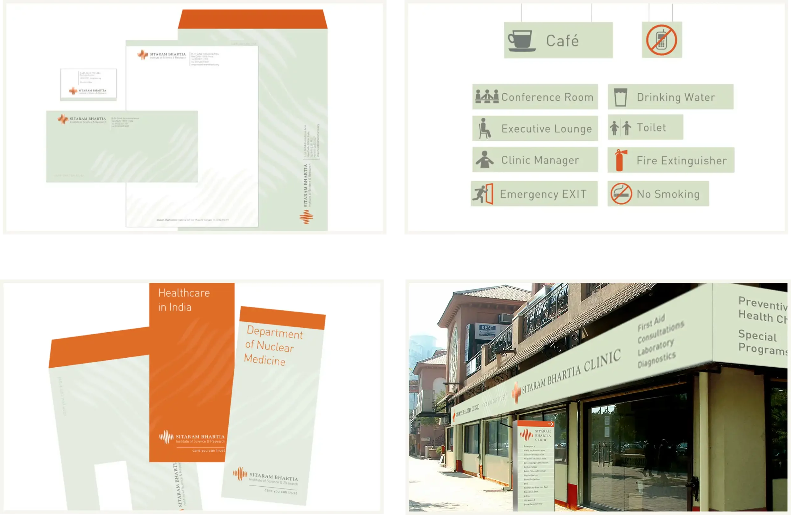
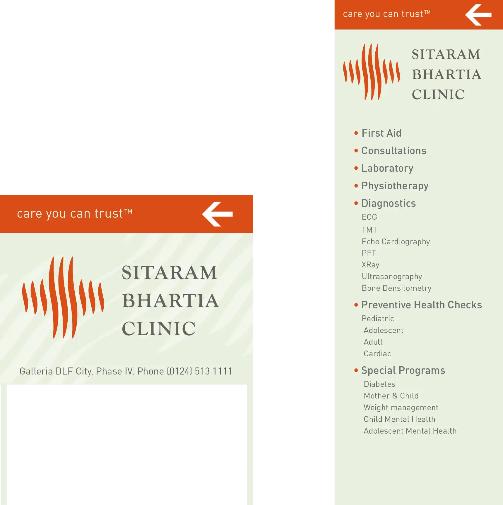
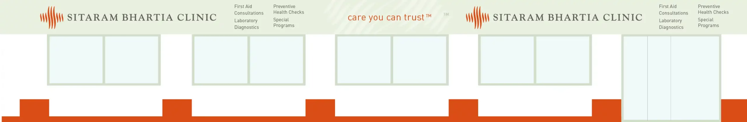
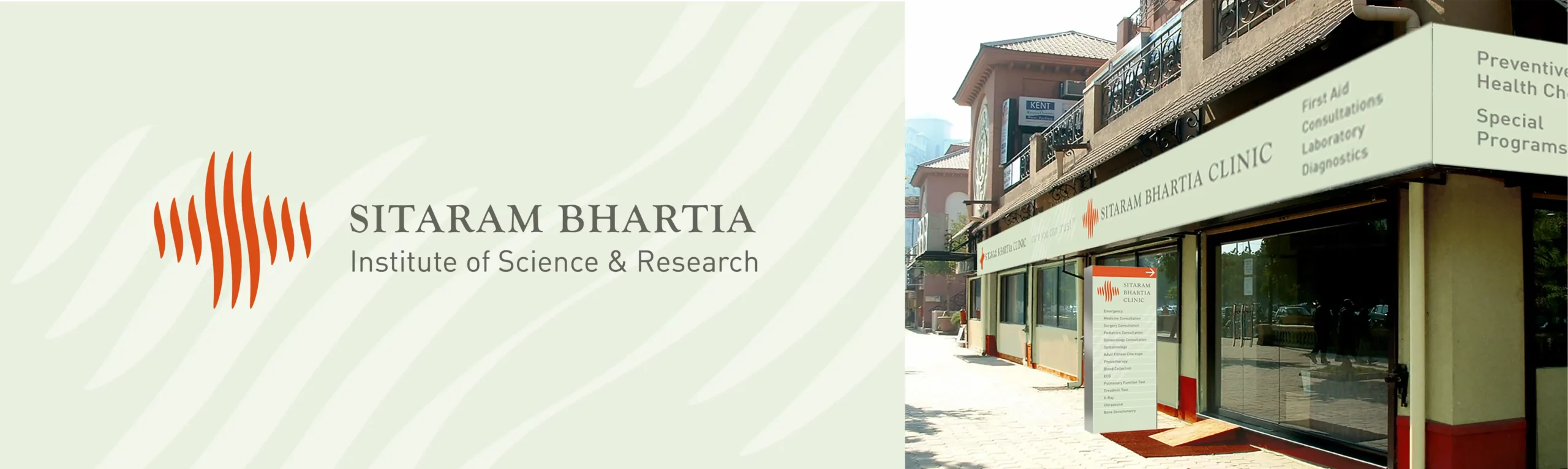
One of our early projects from 2005 – The logo for Sitaram Bhartia Institute of Science and Research was redesigned to keep the ‘sun like’ form of the previous identity and use the emblem of the medical cross, since the name of the Healthcare Institute did not carry the word ‘hospital’ in its name. Fisheye combined the colour palette of terracotta and oat, in the design of the visual identity, taking inspiration from the natural stone used in the construction of the Institute. The pattern of the sun rays from the logo acts as a visual mnemonic across applications.