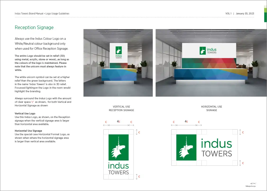
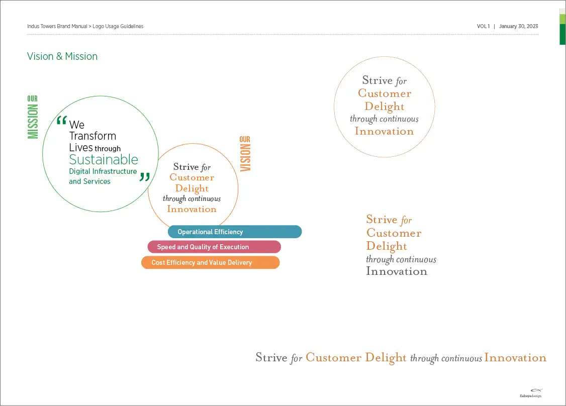
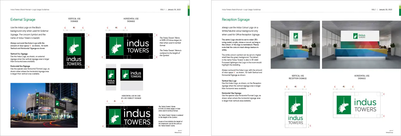
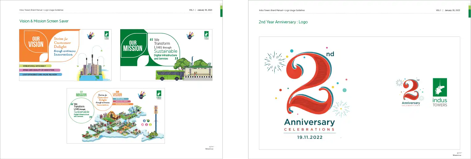
Client : Indus Towers Limited
Brand Identity Manual
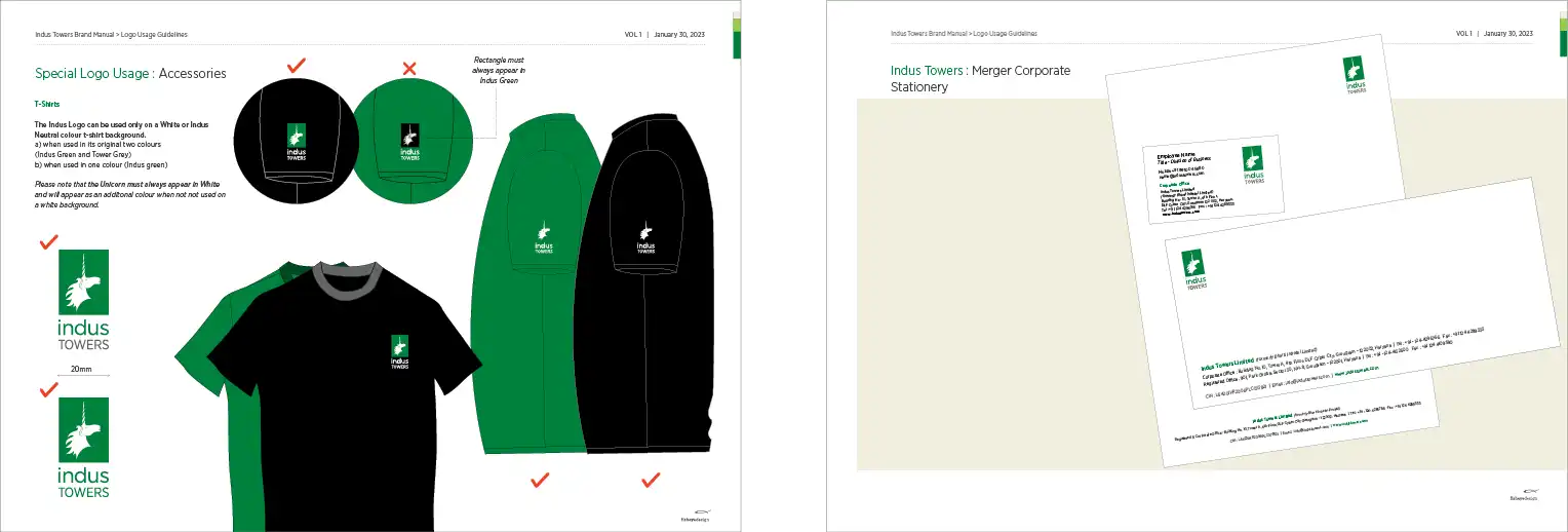
Indus Towers Brand Manual & Style Guide
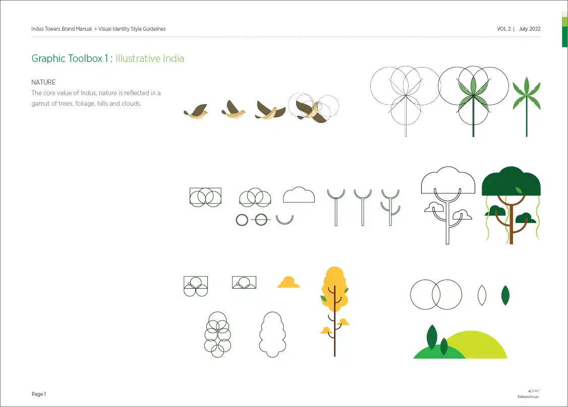
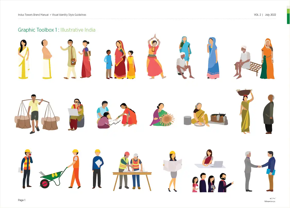
Fisheye has created the visual brand identity manual for Indus Towers and has been updating and maintaining the manual since 2012 to date. Whilst we have not designed the logo, we have recreated the the unicorn form and typography for a more contemporary and print ready logo. The greatest challenge in maintaining the visual style of the brand was the rapid change in the technology and products of the telcom infrastructure industry over the past 10 years. The growth and reach of the Indus Towers and its telecom circles and offices across India was tremendous and communication required to build the brand, train employees, communicate the business to its customers, partners, landlords and investors became paramount. We needed to create a strong, yet simple visual language which could be understood across villages, urban towns and cities of India. And these needed to be in the form of simple illustrations and icons in bright colours, templates, grids, icons which would need to be adapted to suit the geography and culture of people across India. The recent merger of Bharti Infratel and Indus Towers by way has now created a pan-India tower
company, with over 163,000 towers, operating across all 22 telecom service areas in India.
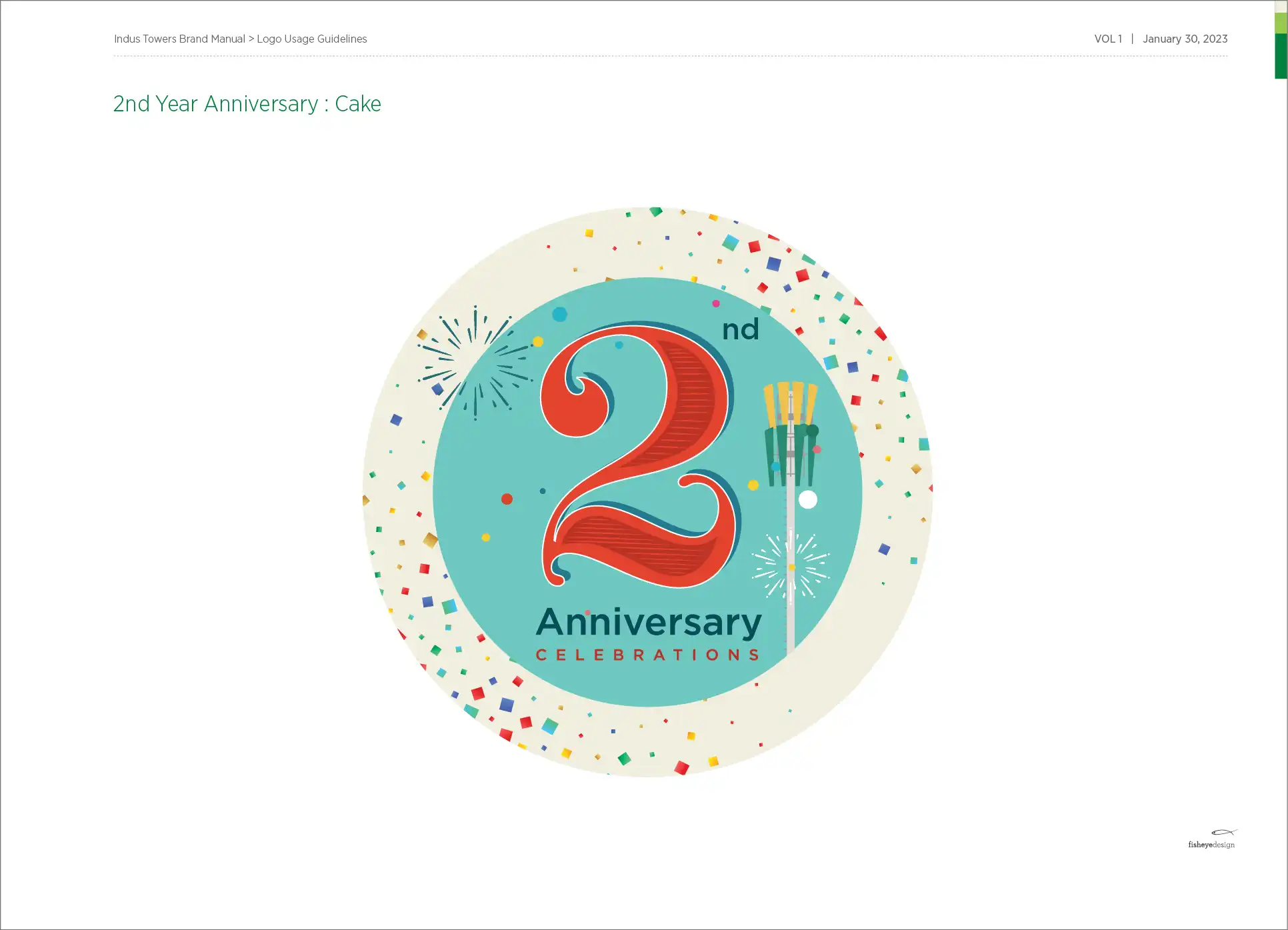
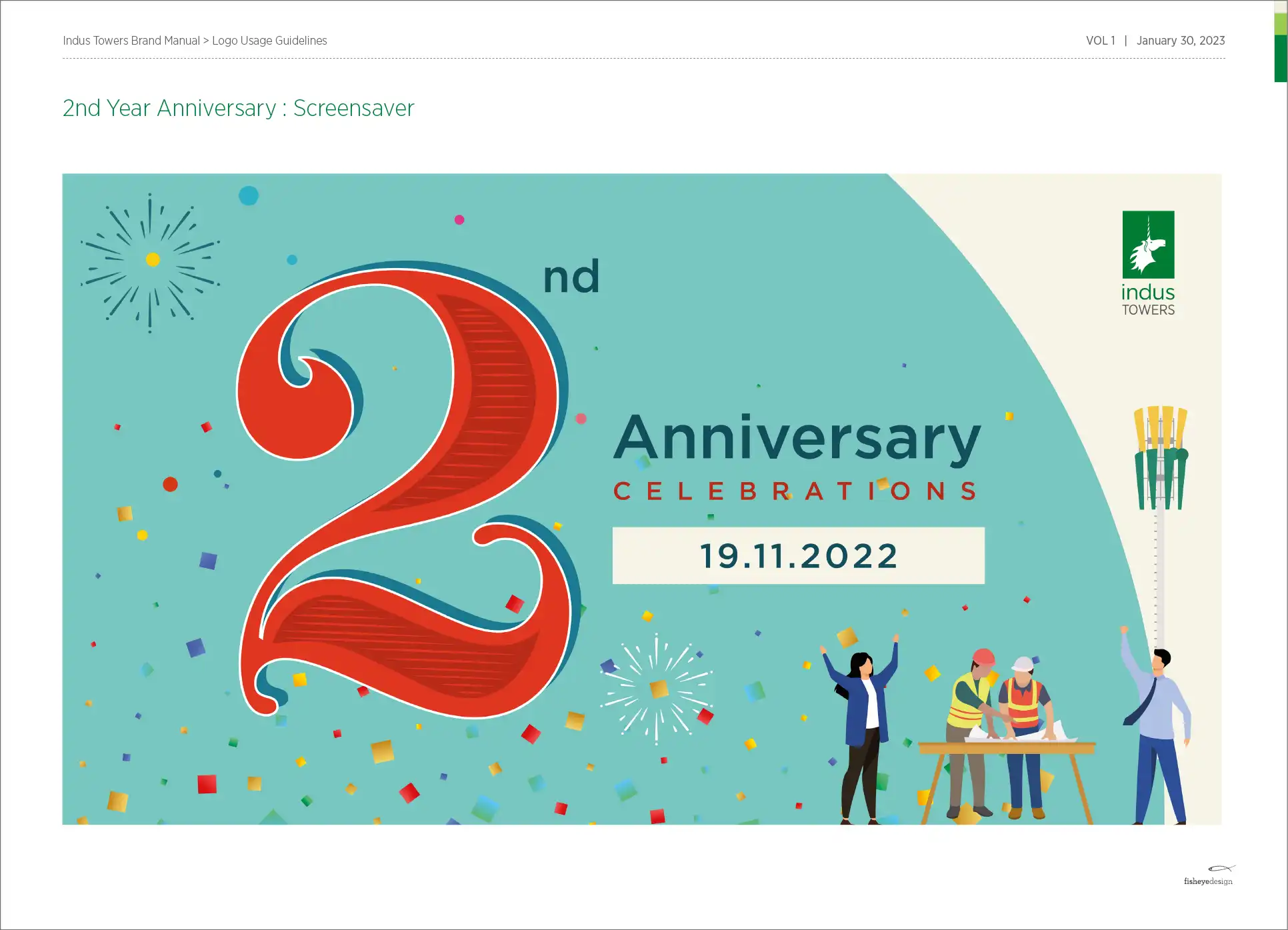
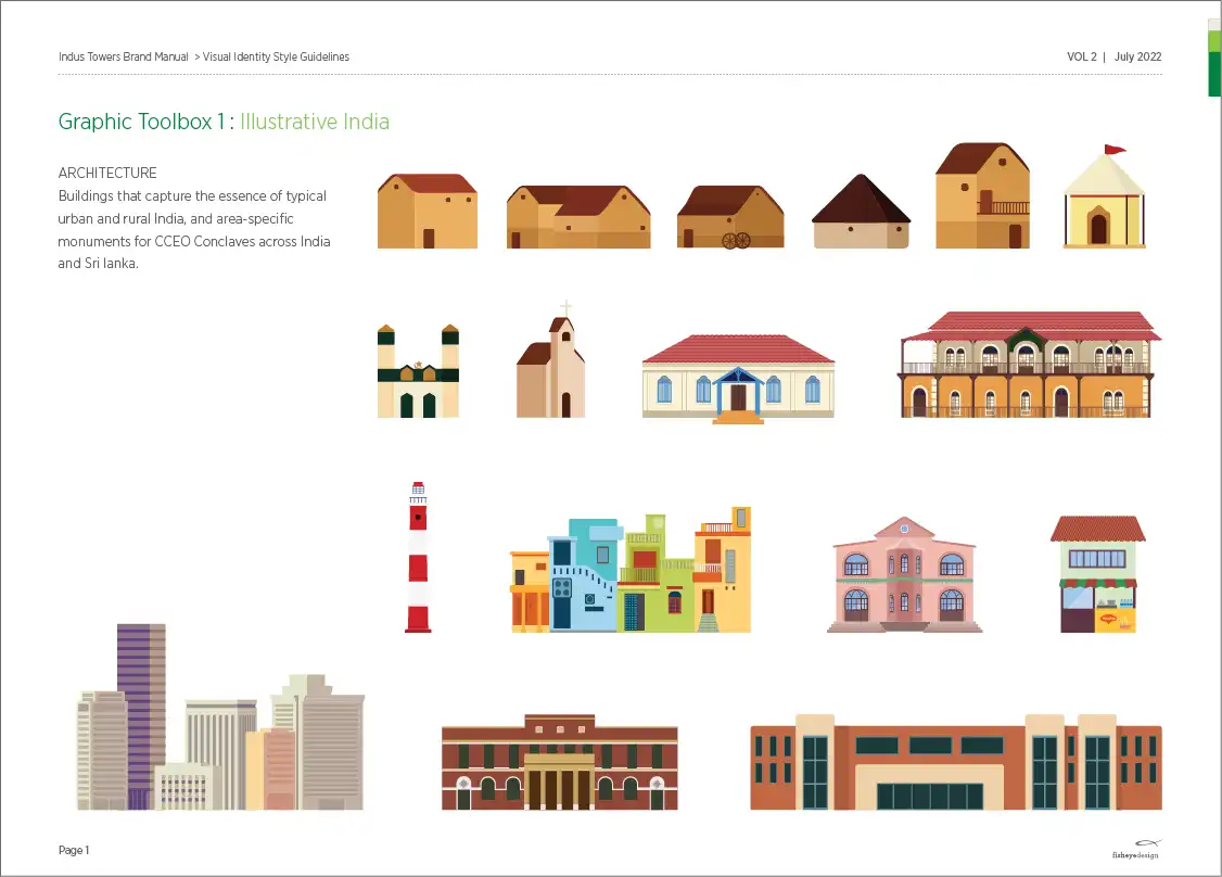
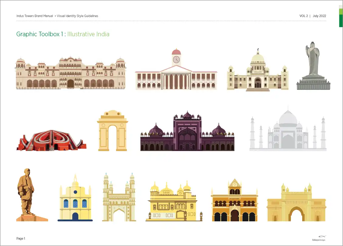
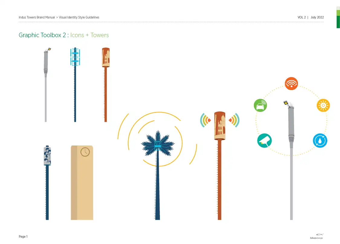
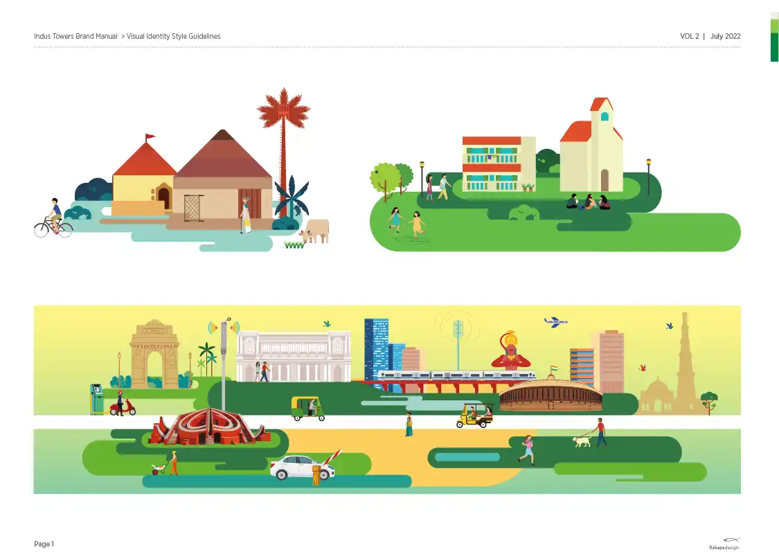
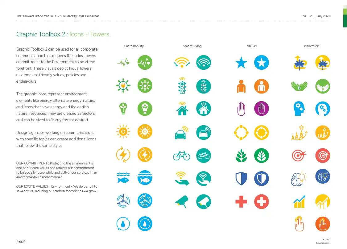
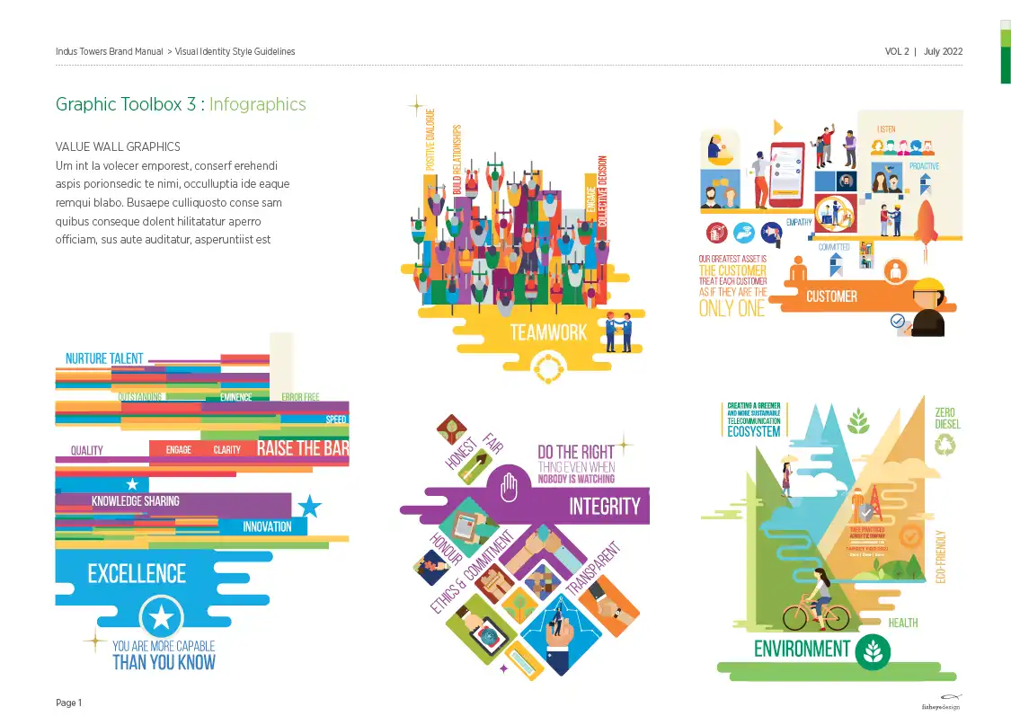
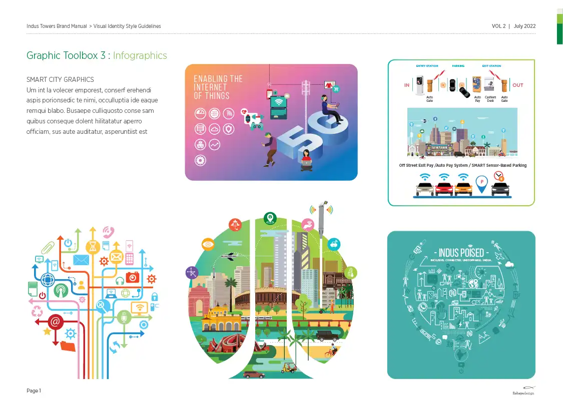
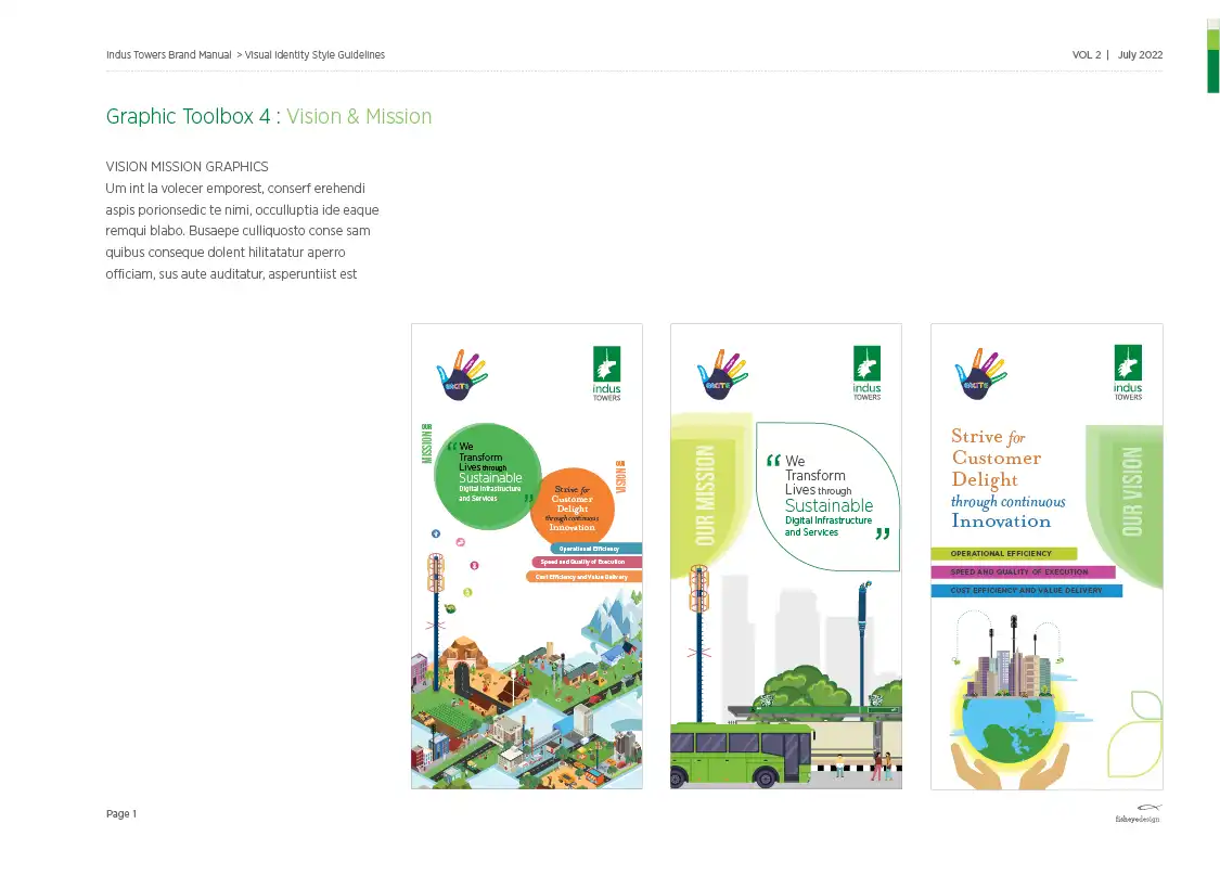
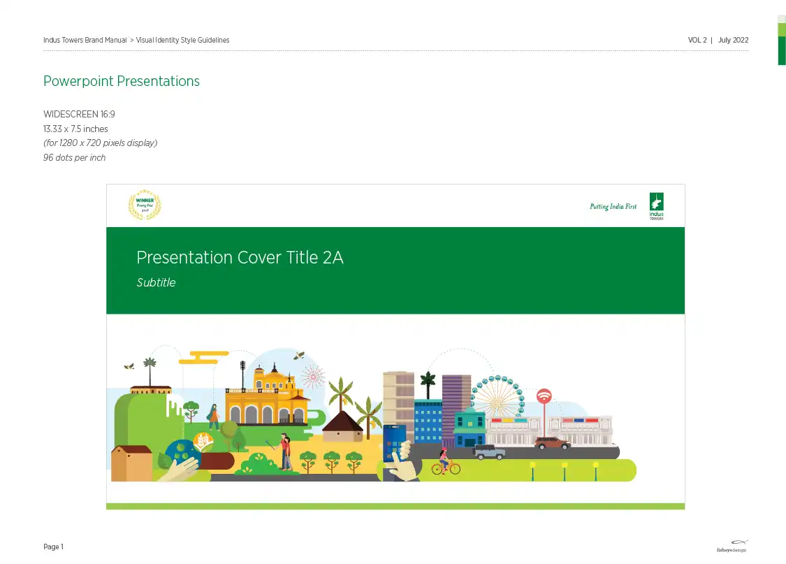
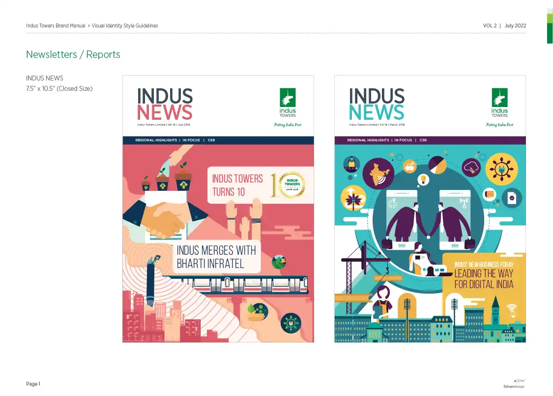
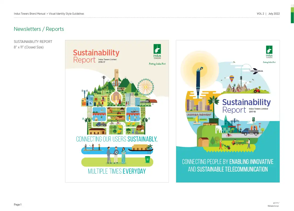
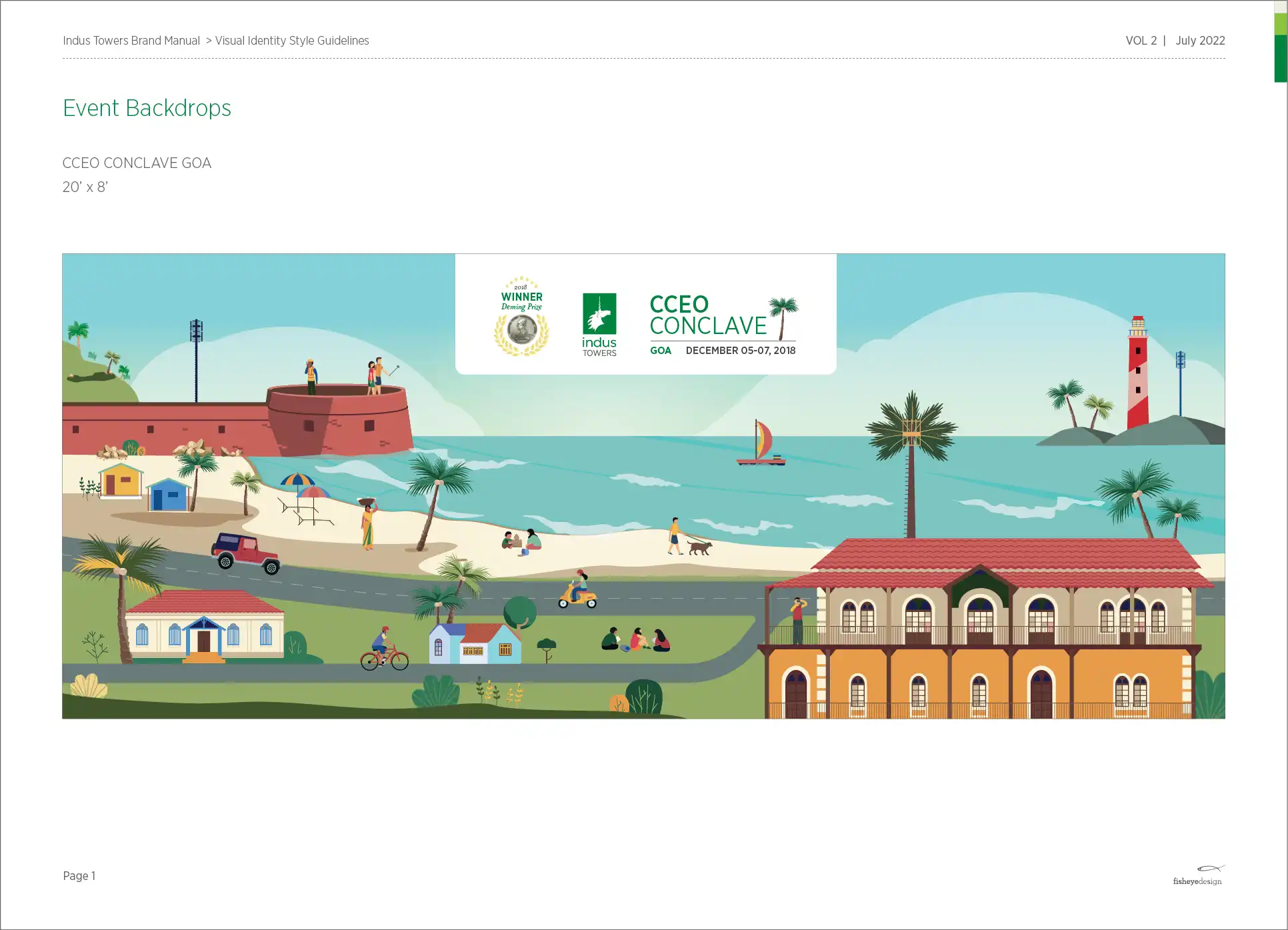
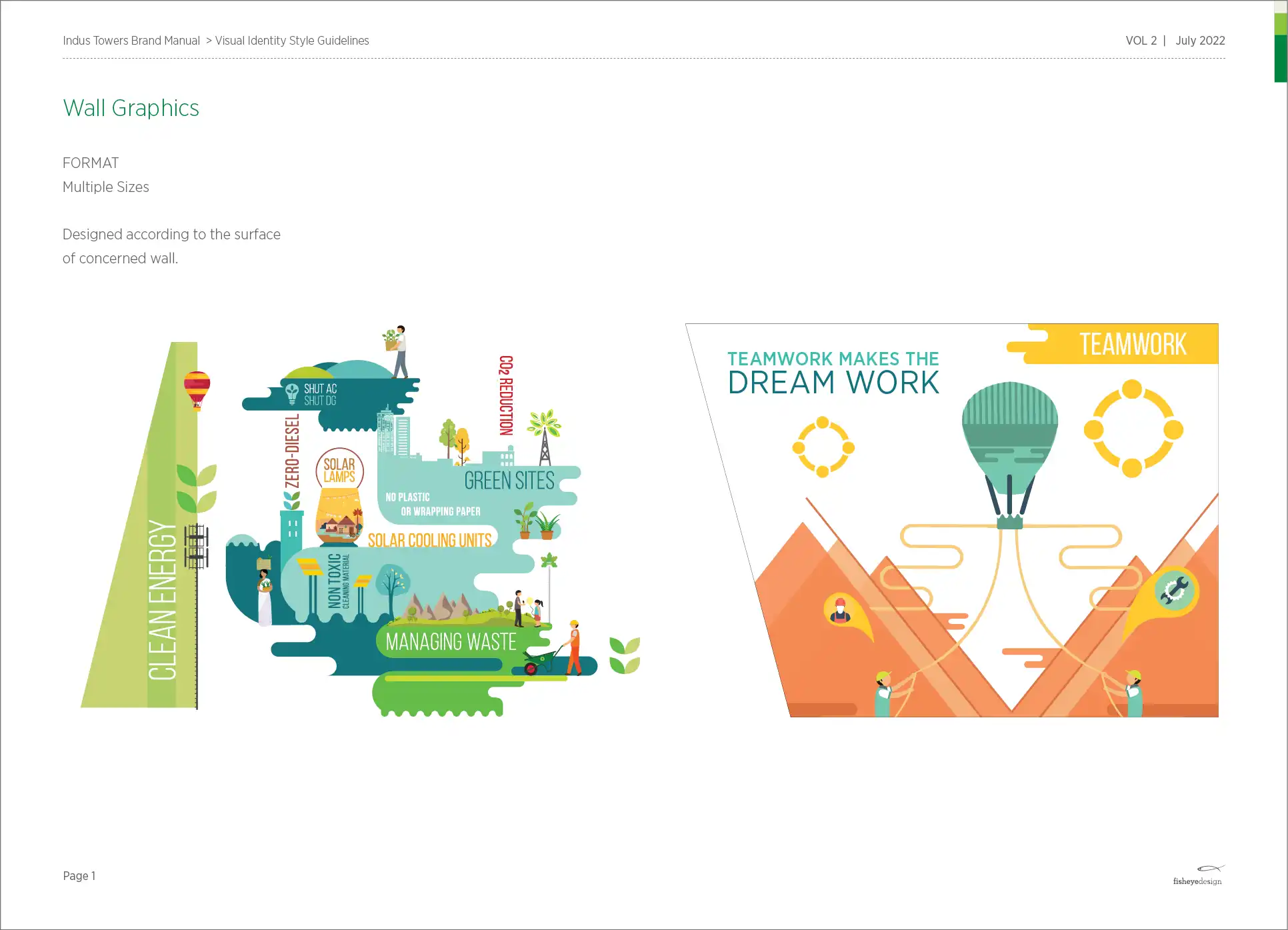
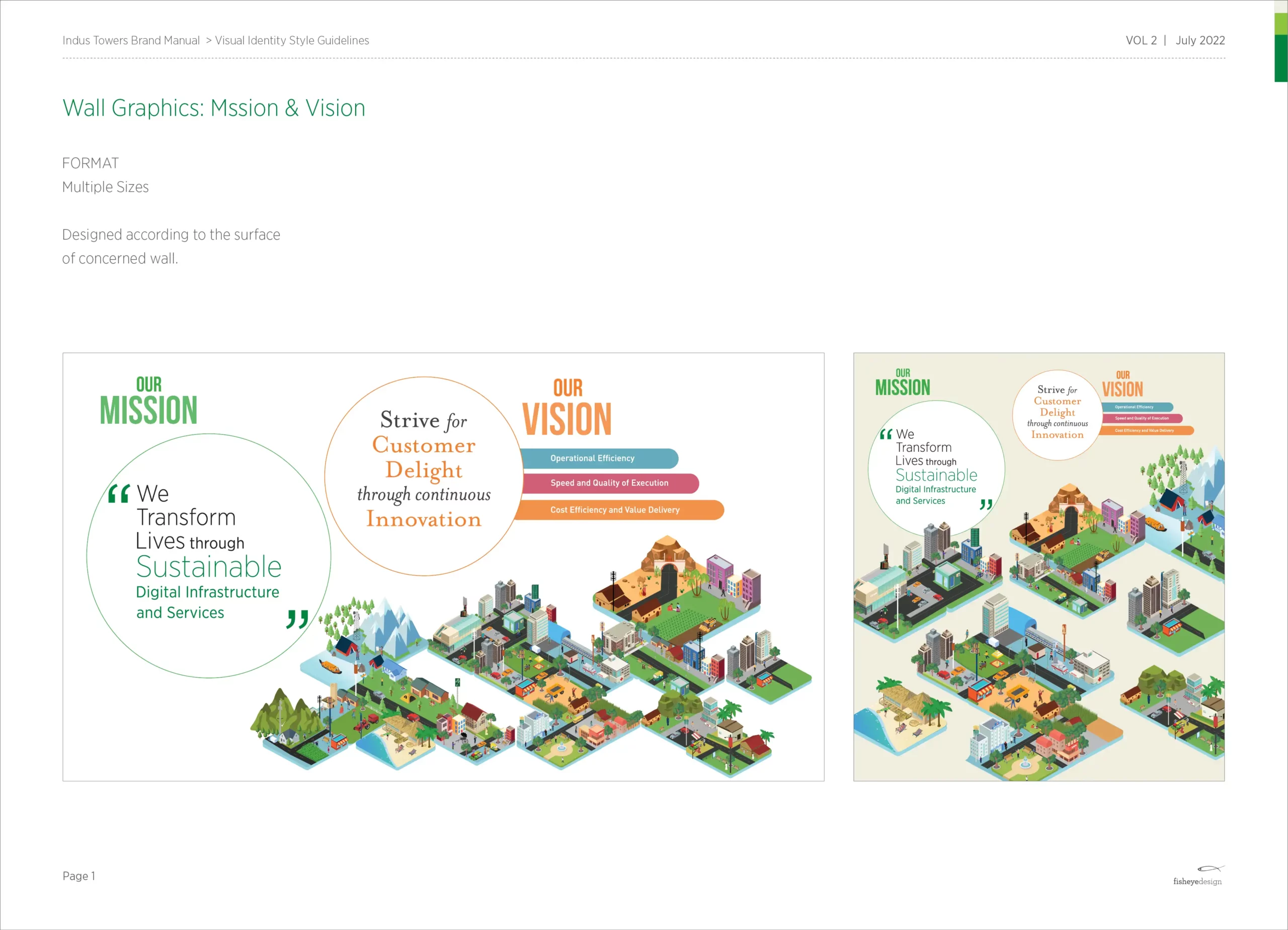
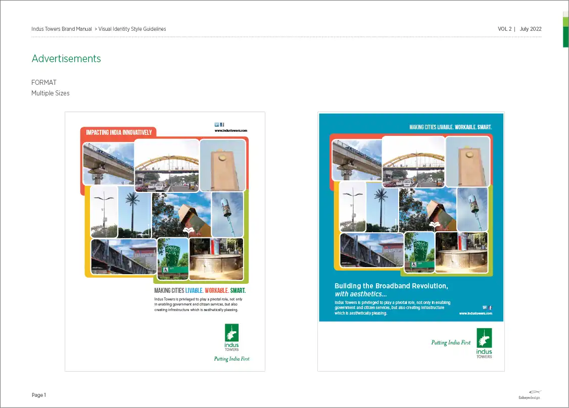
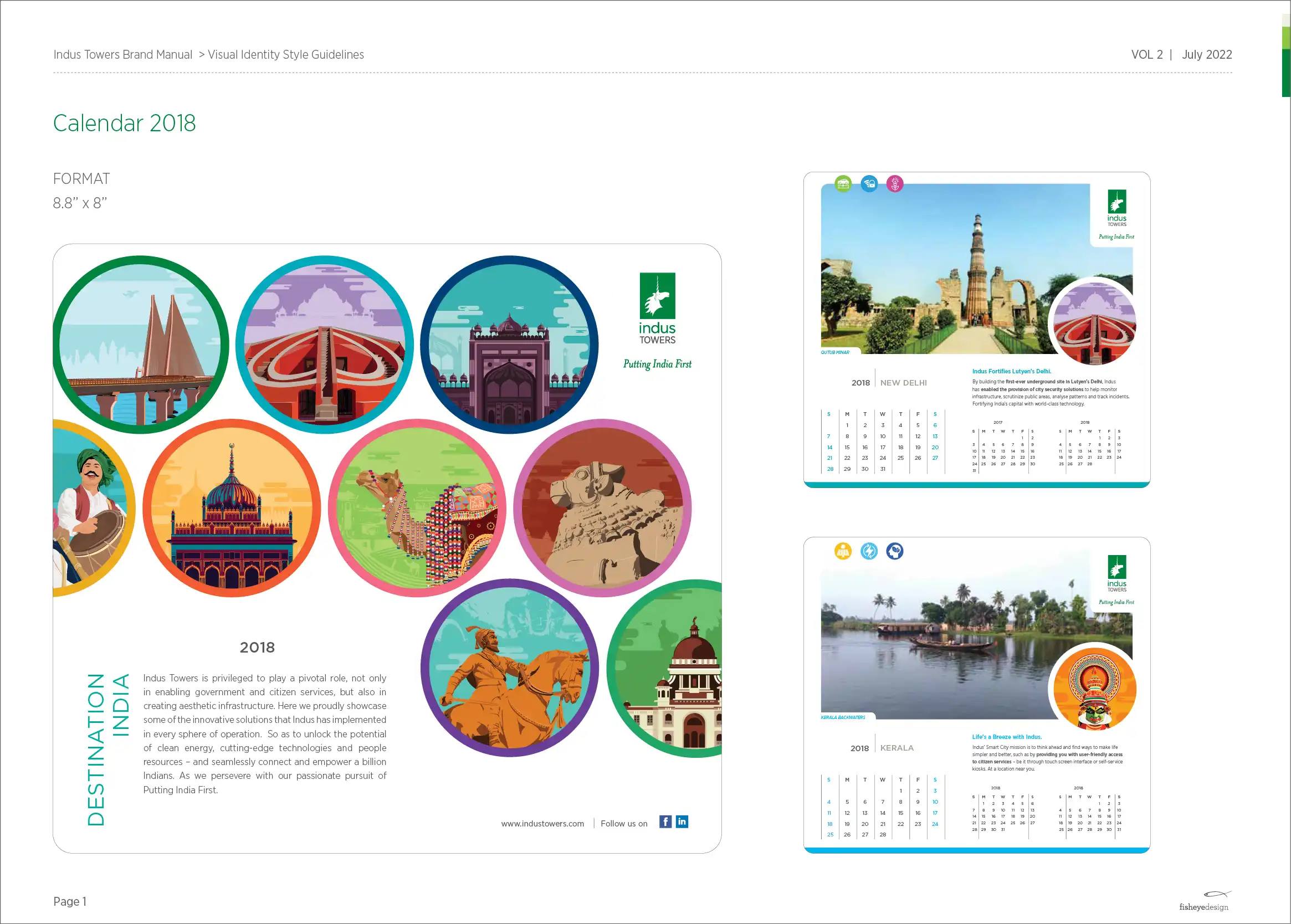
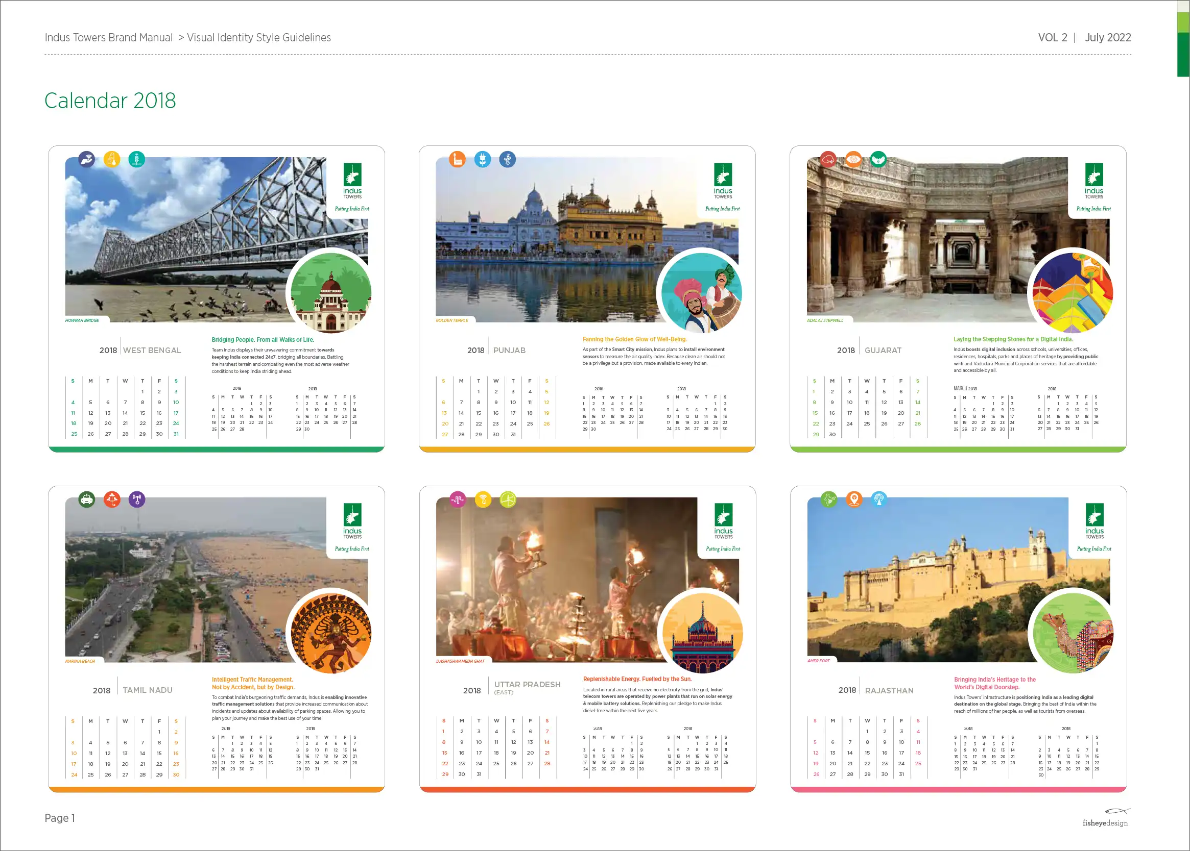
STYLE GUIDELINESGRAPHIC TOOL BOX & STYLE GUIDELINES