Client : William Tonor, Beijing
WEBSITE
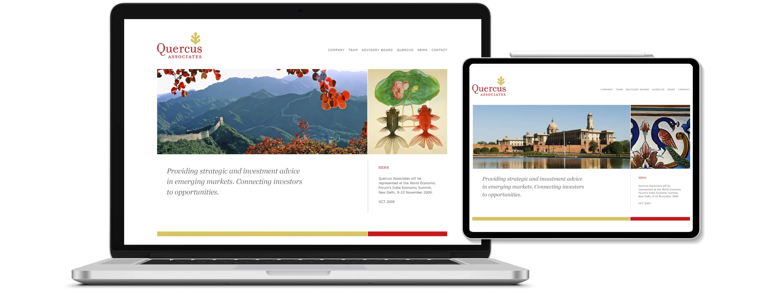
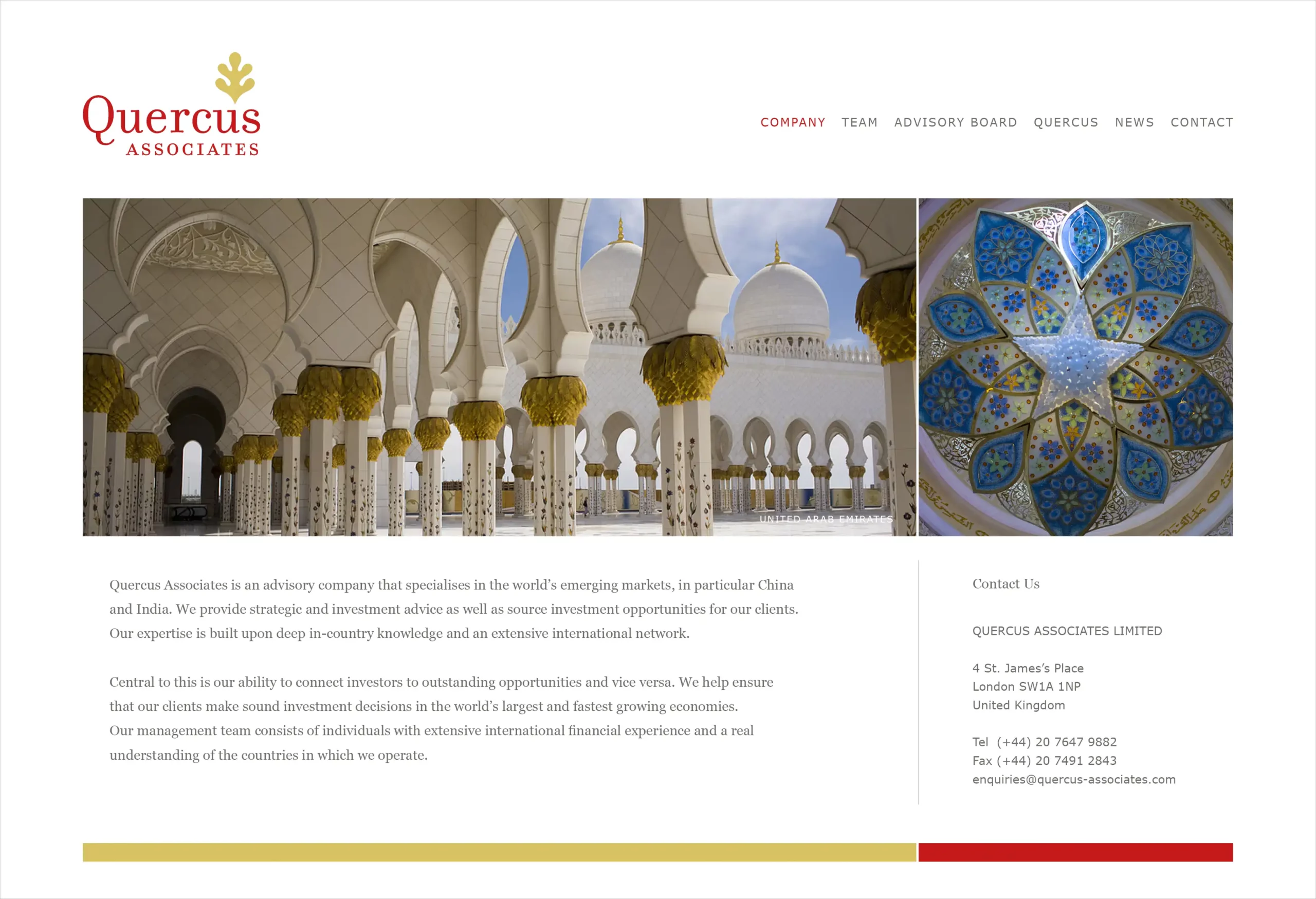
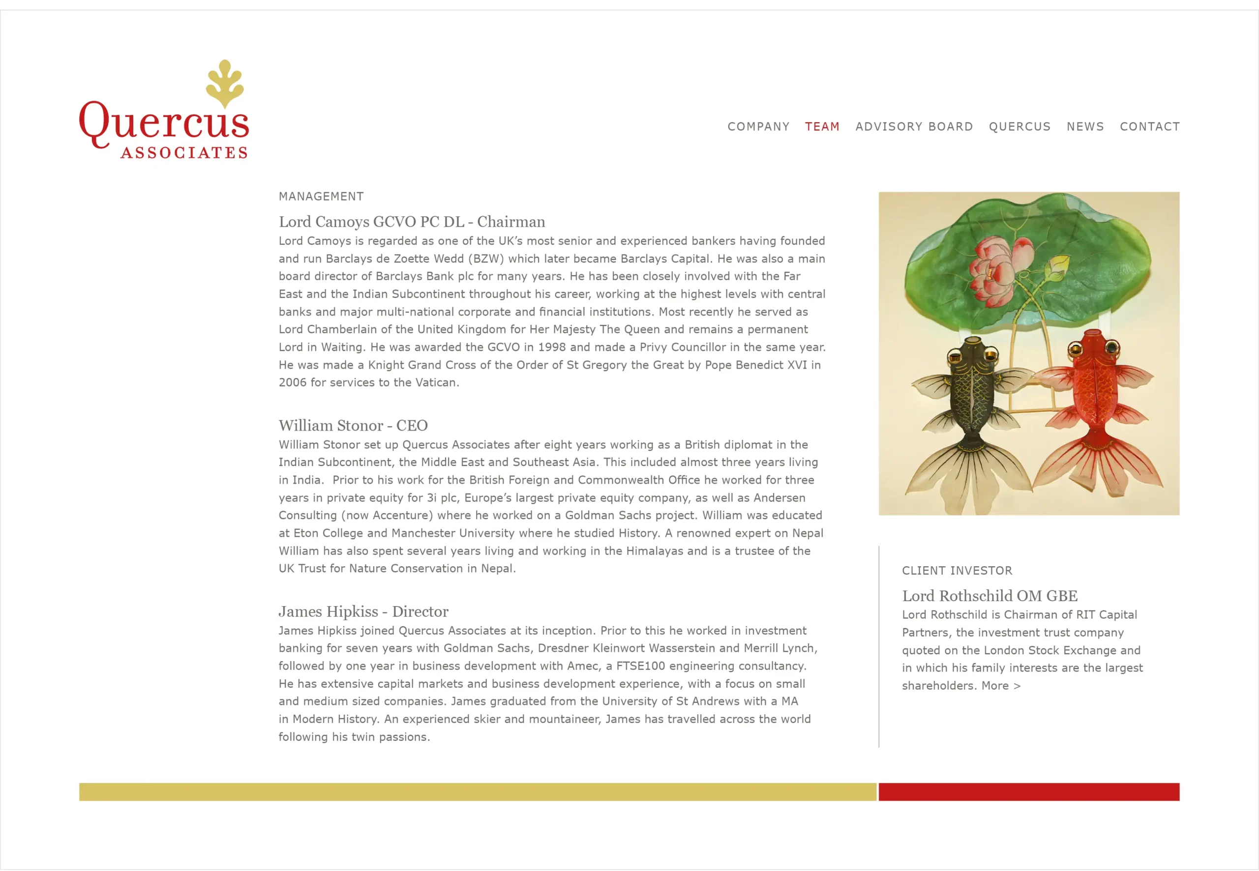
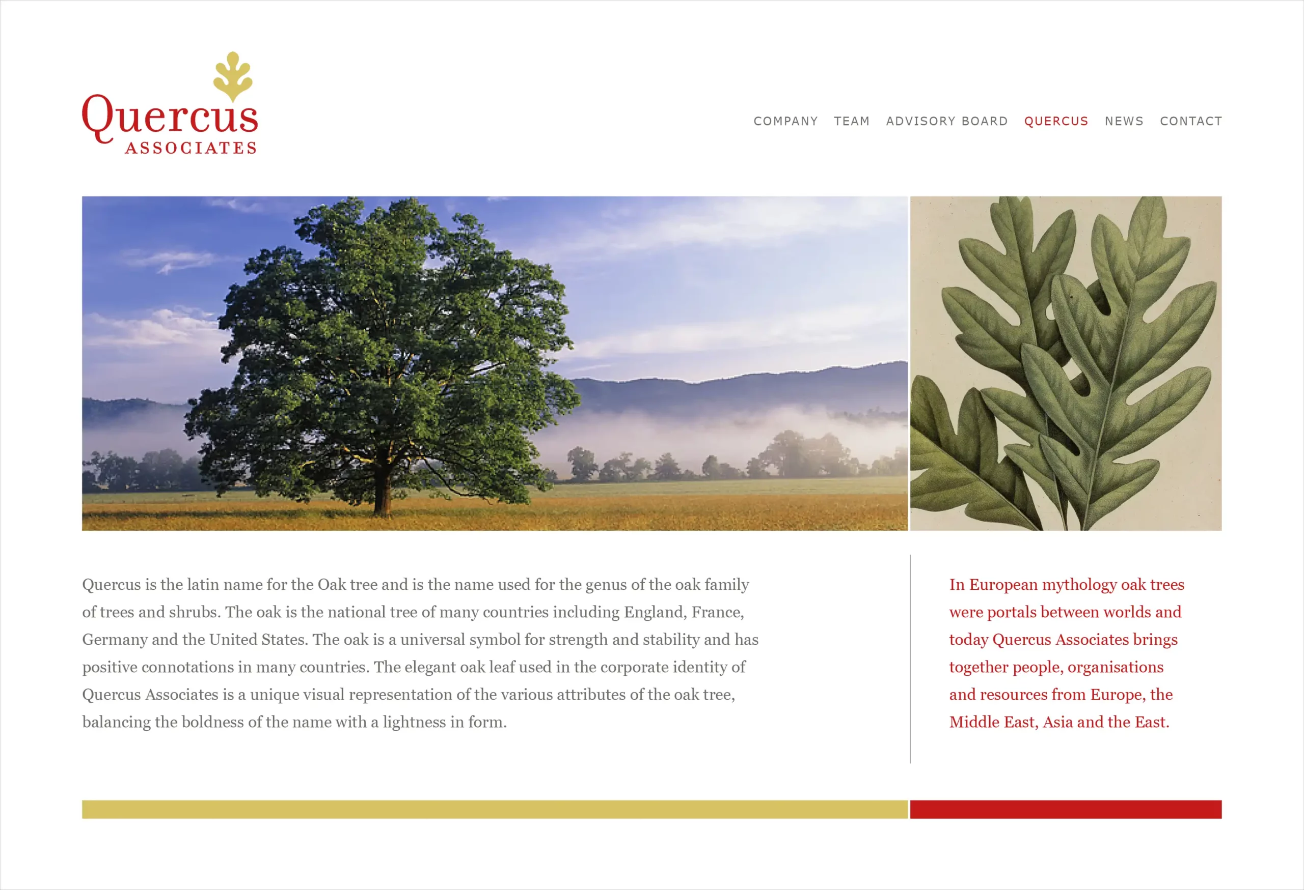
Quercus Associates
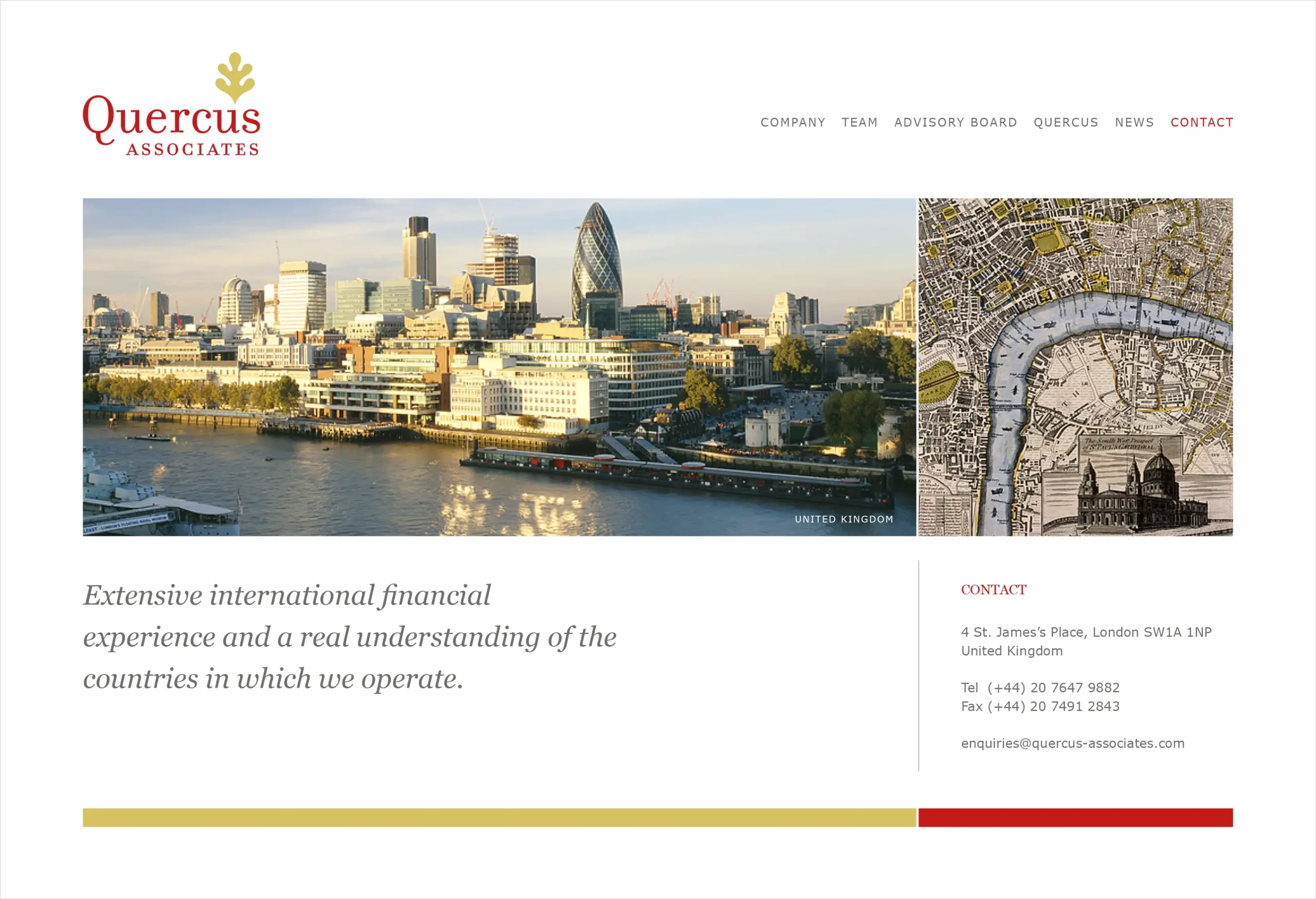
The identity for an advisory company that specialises in investment advisory in the world’s emerging markets, is a stylised representation of the oak tree leaf (Quercus is Oak in Latin). The red and gold palette were chosen as are the main logo colours to reach out to an audience in the east, where the colours are considered auspicious. The grid and navigation of the wesbite is simple with positive imagery of China, India and London as progressive markets for investment.
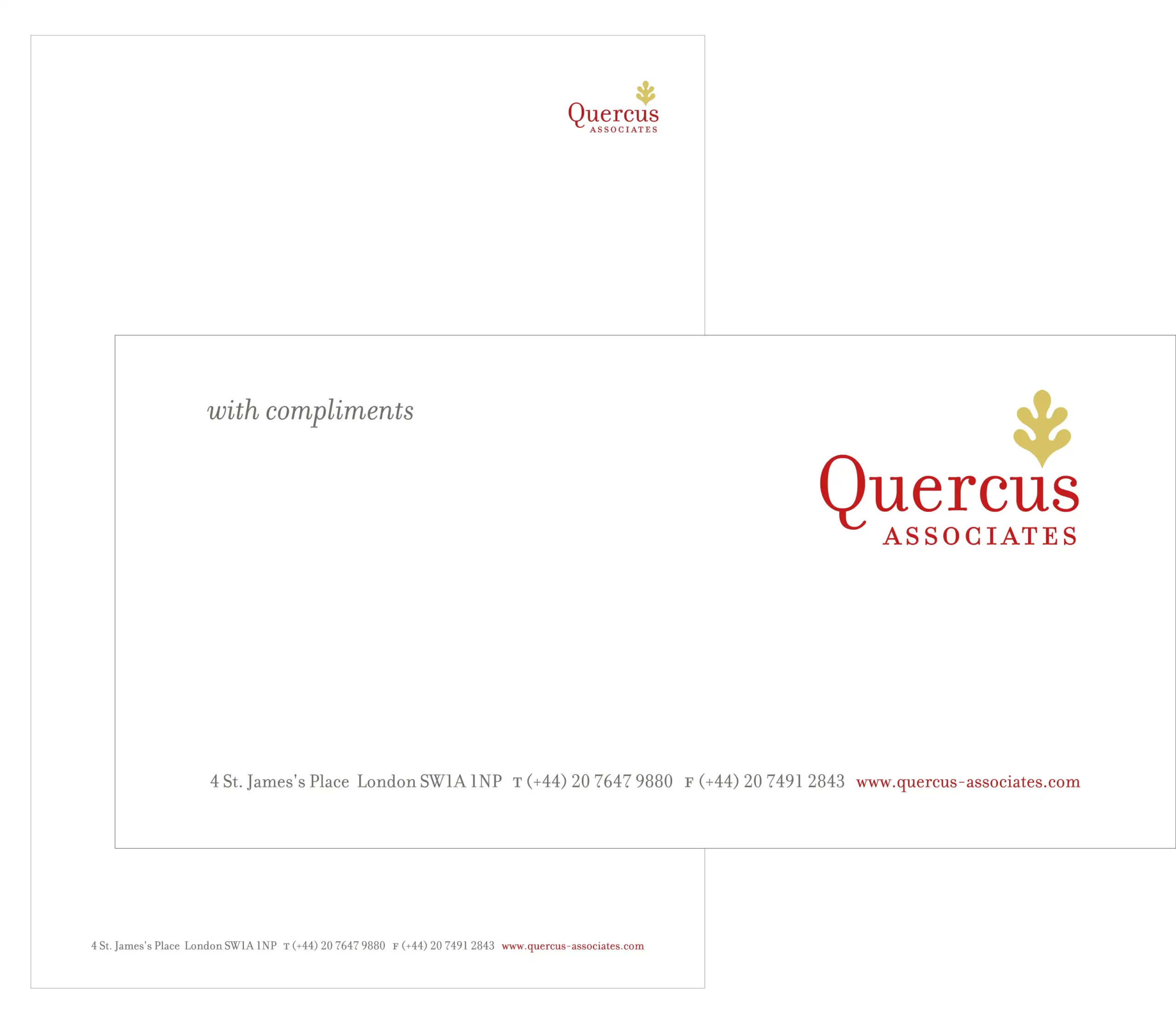
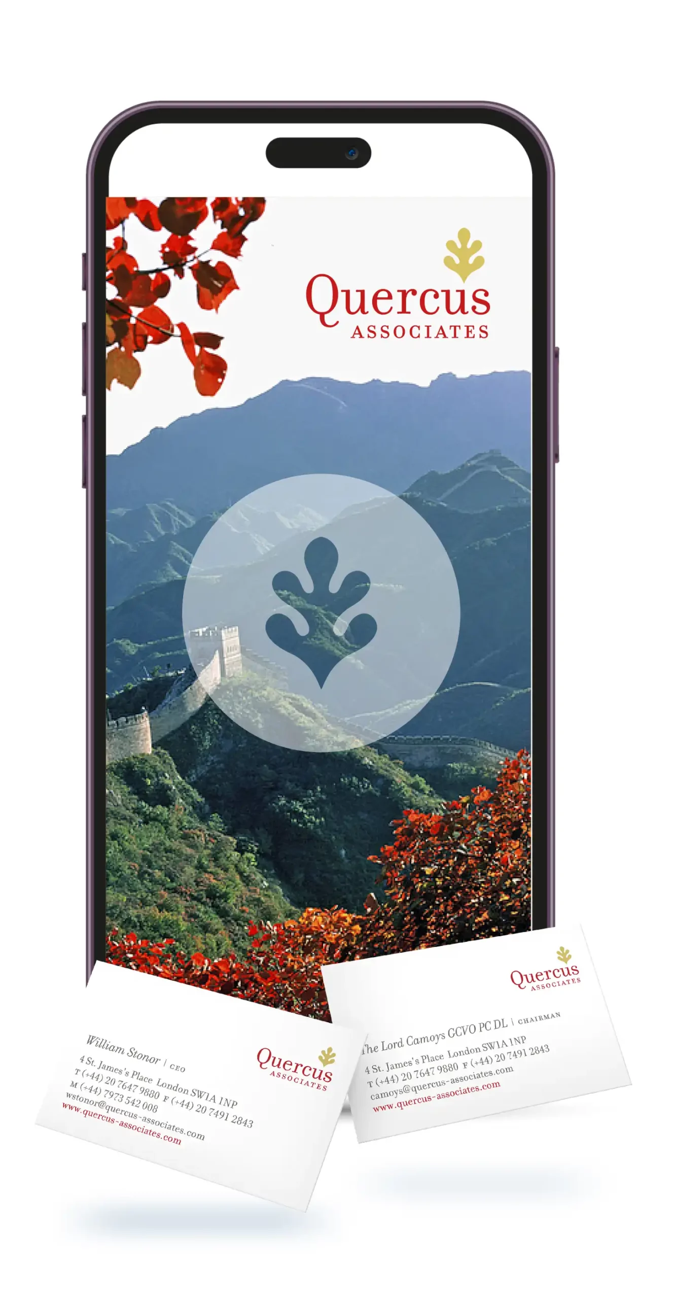
The elegant oak leaf used in the corporate identity of Quercus Associates is a unique visual representation of the various attributes of the oak tree, balancing the boldness of the name with a lightness in form.