The identity for an advisory company that specialises in investment advisory in the world’s emerging markets, is a stylised representation of the oak tree leaf (Quercus is Oak in Latin). The red and gold palette were chosen as are the main logo colours to reach out to an audience in the east, where the colours… Continue reading Quercus Associates
Category: Uncategorized
Minerva Resolutions
The Goddess Minerva is often depicted with her sacred creature, an owl usually named the “owl of Minerva”, which symbolised her association with wisdom and knowledge. Our brief was clear to use the ‘learned’ owl as the symbol for Minerva Resolutions – an Insolvency Professional Entity founded by three IPs with high standards of work… Continue reading Minerva Resolutions
Indus News

Apart from the Corporate Branding and Communication, Fisheye designs various other communication collaterals for Indus Towers to connect, communicate and inspire people working at Indus. Indus News engages with customers to gain trust and to understand concerns and expectations. Reports and Newsletters give information on innovative telecom infrastructure products and solutions, enhanced efficiencies, reduced costs… Continue reading Indus News
Sangath Goa
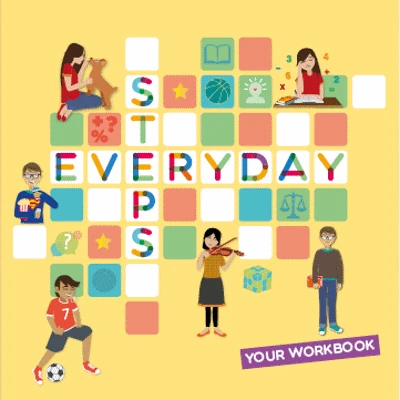
Sangath in Goa, widely known as one of India’s most reputed not-for-profits in making mental health services across age spectrums accessible and affordable. Sangath believes in empowering ordinary people, referred to as lay counsellors, to deliver the psychosocial interventions in communities. At Fisheye, we worked with Sangath to create an illustrative workbook template – to… Continue reading Sangath Goa
Indus CSR
As part of our retainership with Indus towers, Fisheye created several identities and communication design for their varied initiatives across verticals. After the recent Indus Merger, ‘Saksham – Education’ and ‘Pragati – Progress’ became core focus corporate social responsibility areas for Indus Towers. We developed the communication and design as per brief and applied the… Continue reading Indus CSR
Osmos
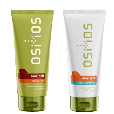
The logo and packaging identity system was developed for Osmos – a range of botanical body care products for men. The colours, typoraphy, product graphics and logo visually position the brand as fresh and organic with and appeal to the metrosexual urban male.
Golf India Lifestyle
Rishi Narain Sports Marketing (RNSM) is one of India’s leading sports marketing and management companies. Fisheye had designed the logo for RN Golf when the company was conceived over 25 years ago. For one of the many golf events that RN Golf organised, we designed the identity for the premium Golf Lifestyle Events to be… Continue reading Golf India Lifestyle
Law Chambers of Swathi Sukumar
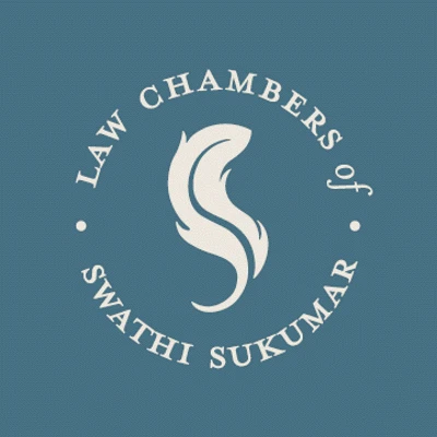
Quill pens are symbolic of a Courtroom scene – white quill pens are placed on the arguing attorney’s tables, a tradition dating back to the earliest days of the court. The Logo for advocate Swathi Sukumar uses the quill in the form of an S and in deep neutral colour tones.
Harvest Gold
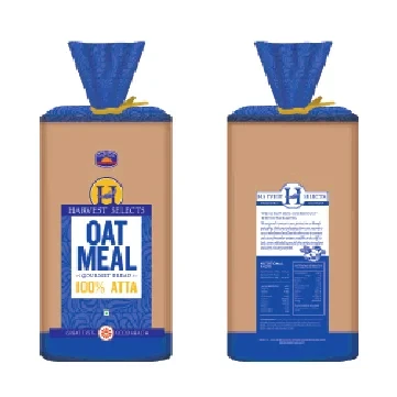
The brand name for Harvest Gold was coined by us way back in 1992…when the concept of production of good healthy bread was conceived by Taab Siddiqui and Adil Hassan. Under their expertise, Harvest Gold soon became the largest bread selling name in the Indian market. Many years later, we worked with Harvest Gold to… Continue reading Harvest Gold
WinZo Games
WinZO offers skill-based games and formats, ensuring fairness and safety and approached Fisheye for their branding and graphical user interface design. An app and logo with an emphasis on localized content for the Indian market with a sense of self worth, fun, addiction, time, speed, hope driven with a desire to win. We created a… Continue reading WinZo Games
